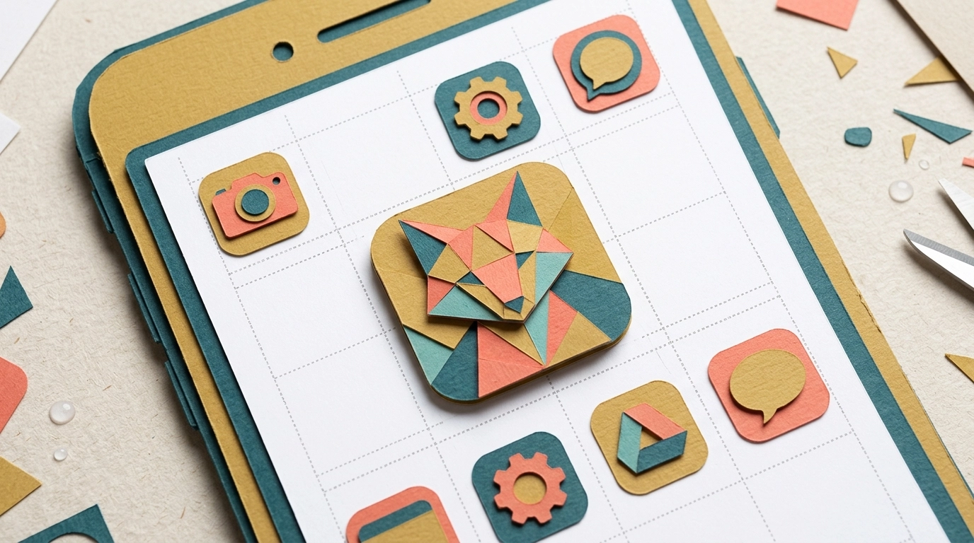
Your app icon is the first thing people see in a crowded app store or on a busy home screen, and your splash screen sets the tone the moment the app opens. Getting both right is less about artistic talent and more about following a handful of technical rules: correct sizes, generous safe zones, and the transparency and rounding conventions each platform expects. This guide walks through exactly how to make an app icon and splash screen that look sharp on every device and sail through store review the first time.
We’ll cover the dimensions Android and iOS actually use, where to keep your important artwork so nothing gets clipped, and how to upload and preview your assets live inside AppLikeWeb’s branding settings before you ship. Finish with the pre-submission checklist and you’ll avoid the most common reasons stores bounce icon and splash assets.
How to make an app icon that works on every platform
The safest starting point is a single, high-resolution square master file. Design at 1024 × 1024 pixels – that’s the size the Apple App Store and Google Play both use for their store listing icon, and it downscales cleanly to every smaller size a device needs. Work in RGB color, keep the artwork centered, and export a crisp PNG.
The two platforms treat icons differently, and knowing the difference saves you a lot of rework:
- iOS icons must be fully opaque squares. Do not add transparency or pre-round the corners – iOS applies its own rounded mask automatically. If you round the corners yourself, you’ll get ugly dark edges once the system mask is applied on top.
- Android uses adaptive icons. The system composites a foreground layer over a background layer and can crop them into circles, rounded squares, or squircles depending on the device. That cropping is why safe zones matter so much on Android.
- The Play Store listing icon is a 512 × 512 PNG with no transparency, while the App Store listing icon is 1024 × 1024. A single 1024px master covers both when exported correctly.
Safe zones and the transparency and rounding rules
A safe zone is the central area of the canvas where your logo, symbol, or wordmark must stay so it never gets clipped by the system’s mask. Android’s adaptive icon system is the strictest here: your full artwork lives on a 108 × 108 dp canvas, but only the central 66 × 66 dp circle is guaranteed to be visible on every launcher. Everything outside that circle can be cropped away.
Translate that into a simple design rule: keep your key elements within the middle ~66% of the square and treat the outer margin as bleed. Follow these conventions and your icon will read correctly whether the device crops it into a circle or a rounded square:
- Center the important stuff. Logos and symbols belong in the inner two-thirds. Let background color or texture fill the outer edges.
- Never bake in the rounding. Supply a full square. Let iOS and Android apply their own corner masks so your icon matches the platform’s native shape language.
- Transparency depends on the platform. Store listing icons must be opaque with no alpha channel. Android adaptive foreground layers may use transparency so the background layer shows through – but the flattened store icon must not.
- Avoid thin lines and small text. At 48 × 48 pixels on a phone, fine detail disappears. Bold shapes and strong contrast survive scaling; delicate typography does not.
Splash screen sizes and layout
A splash screen shows for a second or two while your app initializes. The goal is a clean, branded moment – not a marketing billboard. Because phones, tablets, and desktops come in wildly different aspect ratios, the smartest approach is a solid or gradient background color plus a centered logo, rather than a full-bleed photo that will crop unpredictably.
- Center your logo and keep it within the middle third of the screen so it stays clear of notches, rounded corners, and status bars on every device.
- Use a background color that matches your logo art so the splash feels seamless as it transitions into your app content. Setting the splash background to the same color as your brand palette avoids a jarring flash.
- Provide a high-resolution logo (a transparent PNG works well) so it stays crisp when scaled up on large tablet and desktop displays.
- Keep it simple. Skip loading spinners, taglines, or long paragraphs – the splash is on screen too briefly to read, and clutter looks unpolished.
Uploading and previewing assets in AppLikeWeb
AppLikeWeb converts your existing responsive website into native apps for Android, iOS, and desktop, and its branding settings are where your icon and splash come to life. Once you’ve prepared your master files, the workflow is quick:
- Open your project’s branding settings, where you can set the app name, icon, splash screen, and color scheme in one place.
- Upload your 1024 × 1024 icon and your splash logo, then set the splash background color to match your palette.
- Use the live preview to see the app exactly as it will appear while you configure it – adjust the icon, splash, and colors and watch the changes update immediately.
- Check how your logo sits within the safe zone in the preview, then tweak sizing or padding until nothing important sits near the edges.
- Confirm the app name renders cleanly under the icon – short names avoid truncation on home screens.
The live preview is the fastest way to catch clipping and contrast problems before you generate a build. What you see there is what your users get, so iterate until it looks right on the spot.
Pre-submission checklist so stores don’t reject your assets
Both Google Play and the Apple App Store reject icons for predictable reasons. Run through this list before you submit, and you’ll clear review without a resubmission delay:
- Icon exported as a square PNG – 1024 × 1024 master, with a 512 × 512 opaque version for the Play listing.
- No baked-in rounded corners; corners are left square for the system mask.
- No transparency or alpha channel on the store listing icon.
- Key artwork sits inside the central safe zone and survives circular cropping.
- The icon does not imitate Apple, Google, or other brand marks, and includes no misleading badges, prices, or “free” labels.
- Splash logo is centered, high resolution, and paired with a matching background color.
- Everything looks correct in the AppLikeWeb live preview across mobile and desktop.
Ship assets you’re proud of
Great app branding is repeatable, not lucky. Start from one high-resolution square master, respect the safe zone, follow each platform’s transparency and rounding rules, and keep your splash screen calm and centered. Preview every change live so nothing surprises you at build time, then run the checklist one last time before you submit. Do that and your icon will look sharp everywhere – from a 48-pixel launcher tile to a 1024-pixel store listing – while your splash screen gives users a polished first impression.
Ready to see your brand come to life as a real app? Start converting your website with AppLikeWeb and preview your icon, splash screen, and colors live before you publish.